Ryan Power
Print & Production Graphic Designer
Vector Cleanup • Print-Ready Files • Signage & Production Design

Portfolio
Production-focused design across print, signage, and apparel.Each project shown here was prepared for real-world output — digital press, offset, large-format, or screen print.Clean files. Accurate setup. Built to print correctly the first time.
About
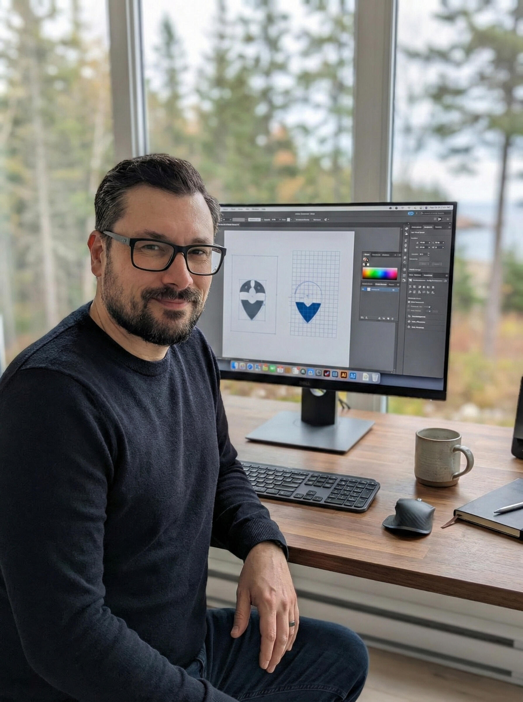
Print-ready design done right the first time.I’m Ryan Power, a Newfoundland-based print and production graphic designer with 20+ years of hands-on experience in commercial print, signage, and apparel production.My career has been built inside real production environments, not just behind a screen.
What I Specialize In
Vector cleanup & logo recreation
Signage & large-format graphics
Screen printing & embroidery setups
Print layout & prepress preparation
Troubleshooting complex PDF files
If it needs to print cleanly and correctly, I make sure it does.
Production ExperienceI’ve worked in high-volume print shops, signage companies, and apparel production environments, building disciplined workflows that prioritize accuracy, speed, and problem-solving under real deadlines.
How I WorkClear communication. Clean, production-ready files. No unnecessary back-and-forth.My goal is simple: deliver work that saves time, prevents reprints, and keeps production moving.If you need files done right the first time, let’s talk.
Contact
Have a project that needs to go to print?Send a brief description including size, quantity, deadline, and any existing files.I respond within 24 hours (Monday–Friday).If it’s urgent, email me directly at:
[email protected]
Thank you
Your message has been received.I respond within 24 hours.If your project is time-sensitive, feel free to email me directly at:[email protected]I look forward to learning more about your project.— Ryan Power
Apparel Graphics & Screen Print Preparation


Coastline Classic — Halftone Conversion for Screen Print Apparel
This project focused on adapting a digitally shaded graphic for reliable screen printing on apparel. The original artwork used smooth gradients and glow effects that cannot be reproduced directly with spot ink. The solution was a controlled halftone conversion, allowing tonal transitions to be printed using standard screen printing methods while maintaining clarity and visual depth on dark garments.
Scope of Work
Conversion of gradient shading into halftone dot structures
Separation of tonal areas for spot-color screen printing
Vector cleanup and preparation of print-safe artwork
Adjustment of shapes and outlines to maintain edge definition
Export of layered artwork for screen print production
Production Considerations
Halftone dots calibrated with proper angle and frequency to avoid moiré patterns
Dot sizes balanced to maintain detail without filling in during printing
White and highlight areas structured for consistent underbase coverage
Registration-safe outlines added to preserve graphic clarity on fabric
Artwork optimized for dark garment printing using standard plastisol workflows
A screen-print-ready apparel graphic that reproduces gradient depth using controlled halftones, allowing print shops to produce consistent results with standard spot-color screens while minimizing registration and ink buildup issues.


Riverdale Volunteer Fire — One-Color Apparel Graphic for Screen Printing
This project focused on developing a durable, one-color apparel graphic designed specifically for screen printing on department merchandise. The objective was to create a bold emblem that would remain legible on dark garments while minimizing production complexity and ink usage. The final design uses controlled line weight, clear negative space, and simplified shapes to ensure consistent output across high-volume print runs.
SCOPE OF WORK
Creation of a single-ink apparel graphic built for screen printing
Vector illustration of fire service emblem and supporting typography
Stroke weight balancing to maintain clarity on fabric
Simplification of interior details to prevent ink fill-in
Export of press-ready vector artwork for apparel production
PRODUCTION CONSIDERATIONS
Single spot-color design reduces setup time and print cost
Thick strokes maintain visibility on textured fabric surfaces
Controlled negative space prevents detail loss during printing
Closed vector paths ensure reliable screen exposure and ink flow
Artwork structured for easy scaling across shirts, hoodies, and department gear
A production-ready one-color graphic that prints cleanly on dark garments, enabling reliable high-volume apparel runs with minimal setup complexity for print shops.


Atlantic Coast Aquatics — Logo Adaptation for Embroidery Production
This project involved preparing a detailed event logo for embroidery across apparel and promotional garments. The original digital artwork contained overlapping shapes, fine splashes, and narrow spacing that required refinement to stitch cleanly. The final vector structure was optimized to preserve the design while ensuring reliable digitization and consistent results across embroidered applications.
SCOPE OF WORK
Vector refinement of detailed logo artwork for embroidery compatibility
Adjustment of small shapes and spacing to prevent thread fill-in
Stroke weight balancing to maintain clarity in stitched output
Simplification of layered elements for efficient stitch paths
Preparation of embroidery-friendly master artwork for digitizing
PRODUCTION CONSIDERATIONS
Minimum spacing adjusted to prevent thread bridging and detail loss
Shapes simplified to reduce excessive stitch density
Balanced line weights ensure readability on small embroidered applications
Controlled color structure supports clean thread separation
Artwork organized for predictable digitization and embroidery scaling
An embroidery-ready logo that maintains the character of the original design while ensuring clean stitching, predictable digitization, and reliable reproduction across embroidered apparel and event merchandise.


North Shore Sluggers — Spot Color Separation for Screen Print Production
This project focused on preparing an apparel graphic for clean multi-color screen printing through controlled spot color separation. The goal was to maintain strong visual contrast while ensuring each ink could be printed independently without registration issues. The final artwork was structured with clearly defined spot layers, allowing print vendors to produce consistent results with predictable press setup.
SCOPE OF WORK
Development of a multi-color apparel graphic optimized for screen printing
Separation of artwork into individual spot-color layers
Vector cleanup and refinement of graphic elements and typography
Adjustment of overlapping shapes to maintain clean color boundaries
Preparation of press-ready files for garment printing
PRODUCTION CONSIDERATIONS
Each color isolated on its own separation layer for accurate screen output
Solid fills used instead of gradients to maintain reliable ink coverage
Controlled overlaps prevent gaps during press registration shifts
Simplified shapes maintain clarity on fabric texture
Artwork structured for consistent output across light and dark garments
A fully separated, press-ready apparel graphic that allows screen printers to produce reliable multi-color prints with predictable registration, clean ink coverage, and efficient setup across production runs.
Vector Logo Recreation & Cleanup


HarborGoods Co. — Vector Logo Recreation & One-Color Production System
This project focused on converting a multi-color, illustration-heavy logo into a controlled, production-reliable vector system suitable for apparel, embroidery, and general merchandise. The original artwork required simplification and color discipline to reduce print risk while preserving brand character. The final deliverables provide scalable, single-color and pure black versions that perform consistently across decoration methods and vendor environments.
Scope of Work
Full vector recreation with corrected paths and consistent stroke logic
Color reduction from multi-tone illustration to controlled one-color output
Development of simplified and pure black logo variants
Cleanup of overlaps, negative space, and fine details for production safety
Export preparation for screen print, embroidery, and digital use
Production Considerations
Closed, clean paths to prevent stitching and trapping errors
Removal of unnecessary detail to maintain legibility at small sizes
One-color builds optimized for single-screen setups and thread limitations
Stroke and gap tolerances adjusted for embroidery digitization
Black-only version ensures predictable output across vendors and substrates
A press-ready, vendor-friendly logo system that reduces production variables, supports multiple decoration methods, and ensures long-term brand consistency without rework or interpretation errors.


Sunny’s Preserve Co. — Logo Simplification for Screen Printing & Embroidery
This project focused on converting a highly detailed, illustration-driven brand mark into a production-safe logo system for apparel and stitched goods. The original artwork contained gradients, fine detail, and overlapping color that introduced risk in screen printing and embroidery workflows. The solution was a controlled vector rebuild with simplified shapes, disciplined color separation, and reliable one- and two-color versions designed for repeatable production.
SCOPE OF WORK
Full vector recreation and cleanup of the original illustrated logo
Color reduction and simplification for one- and two-color printing
Creation of pure black and single-ink logo variants
Spot-color separation planning for screen printing
Export setup for embroidery digitizing and apparel decoration
PRODUCTION CONSIDERATIONS
Fine illustration detail removed or merged to prevent fill-in on press and thread breaks in embroidery
All paths closed and overlaps resolved to eliminate trapping and stitching errors
Minimum stroke weights and negative space adjusted for small-format garments
Underbase-friendly shapes prepared to support printing on dark substrates
Black-only version ensures predictable output across different shops and equipment
A production-ready logo system that translates cleanly from screen print to embroidery, reduces setup complexity for apparel shops, and minimizes reprint risk while preserving brand recognition across all garment applications.


Industrial Wire & Tool — RGB-to-Print Color Correction & Vector Cleanup
This project addressed the common issue of high-impact RGB logo artwork failing to translate reliably to print. The original logo relied on neon glow effects and RGB color values that are not reproducible in CMYK or spot ink workflows. The solution was a controlled vector rebuild with corrected color values, simplified structure, and print-safe knockouts to ensure consistent results across signage, apparel, and offset or digital print.
SCOPE OF WORK
Full vector recreation and cleanup of RGB-based logo artwork
Conversion from RGB neon effects to print-safe CMYK values
Pantone spot color matching for brand consistency
Removal of glow, gradient, and lighting effects
Preparation of clean flat-color logo variants for print use
PRODUCTION CONSIDERATIONS
RGB glow effects eliminated to prevent muddy or unpredictable CMYK output
Pantone spot colors selected to maintain visual strength without over-inking
Knockout and trapping logic adjusted for clean edge definition
Flat fills and consistent stroke weights ensure compatibility with vinyl, screen print, and signage
Simplified color structure reduces press setup time and minimizes registration issues
A production-reliable logo system that maintains brand impact in real-world print conditions, ensuring consistent color reproduction, reduced press adjustments, and smooth handoff to any print or signage vendor.


BARCS Property Services — Auto-Trace Cleanup & Precision Vector Rebuild
This project corrected a logo that had been created through rough auto-tracing, resulting in unstable geometry and unreliable print output. Excessive anchor points and uneven curves introduced distortion at scale and increased the risk of cutting and printing errors. The solution was a disciplined vector rebuild that restored symmetry, reduced complexity, and produced clean, predictable artwork suitable for signage, apparel, and large-format use.
SCOPE OF WORK
Manual vector reconstruction to replace low-quality live trace output
Significant anchor-point reduction for smoother geometry
Bézier curve refinement for consistent line flow
Shape and symmetry correction across icon and typography
Export preparation for print, vinyl cutting, and digital use
PRODUCTION CONSIDERATIONS
Reduced anchor count improves RIP performance and cutter reliability
Smooth, continuous curves prevent chatter on vinyl cutters and routers
Balanced stroke weights ensure consistent ink coverage at all sizes
Clean geometry eliminates jagged edges and scaling artifacts
Simplified paths reduce file corruption risk during vendor handoff
A clean, production-safe logo with predictable behavior across print, signage, and apparel workflows—eliminating trace-related errors and ensuring consistent results at any scale.


Greenmark 8 Golf Co. — Low-Resolution Logo Rebuild for Scalable Print Use
This project involved reconstructing a brand logo that existed only as a low-resolution, heavily compressed web image. The original file suffered from jagged edges, blurred typography, and compression artifacts that made it unusable for print or merchandise. The solution was a full vector rebuild focused on clean geometry, corrected letterforms, and true scalability for apparel, signage, and promotional use.
SCOPE OF WORK
Manual vector reconstruction from a low-resolution JPEG source
Redrawing of all curves and circular geometry for smooth Bézier flow
Typography correction to restore consistent stroke weight and spacing
Cleanup of artifacts and edge distortion caused by compression
Export of clean, scalable vector files for print and digital use
PRODUCTION CONSIDERATIONS
Rebuilt curves eliminate pixel stair-stepping at large sizes
Clean circular geometry ensures accurate cutting, printing, and routing
Corrected letterforms improve legibility on apparel and small-format items
Flat vector shapes prevent RIP interpretation errors
Artwork scales cleanly from embroidery patches to large-format signage
A fully scalable, production-ready logo that replaces an unusable web asset with clean vector artwork—enabling consistent branding, reliable vendor output, and long-term use across print, apparel, and signage without quality loss.


Forge & Bolt Mechanical Inc. — Damaged Vehicle Decal Reconstruction
This project involved rebuilding a company logo from a real-world reference where the only available source was a damaged, cracked vinyl decal photographed on a service vehicle. The original artwork was distorted by surface curvature, wear, and physical damage, making direct reuse impossible. The solution was a clean vector reconstruction that restored accurate proportions, corrected geometry, and produced a dependable master logo suitable for reprinting, signage, and future fleet applications.
SCOPE OF WORK
Manual vector reconstruction from a photographed, damaged decal
Perspective correction to compensate for vehicle panel curvature
Cleanup and redrawing of broken, missing, or worn elements
Restoration of typography, icon symmetry, and layout balance
Preparation of clean, print-ready vector master files
PRODUCTION CONSIDERATIONS
Rebuilt geometry ensures clean edges for vinyl cutting and printing
Corrected proportions eliminate distortion when applied to flat substrates
Closed paths and simplified shapes reduce failure risk during reprint
Color structure stabilized for consistent output across replacement decals
Artwork prepared to scale reliably across vehicle sizes and materials
A fully restored, production-ready logo recreated from imperfect real-world reference—allowing the client to replace damaged decals, maintain brand consistency, and confidently deploy the artwork across vehicles, signage, and future print applications without quality loss.
Large-Format & Environmental Graphics


Iron Summit Mechanical — Large Format Building Sign (Dibond Panel & Vinyl Layout)
This project involved preparing a large-format building sign designed for exterior visibility and straightforward production using aluminum composite panel signage. The layout was structured to remain legible at distance while allowing the graphics to be produced through vinyl cutting and panel application. The final artwork prioritized clean vector geometry, balanced spacing, and reliable installation across a scaled building façade.
SCOPE OF WORK
Vector layout development for large-format exterior signage
Logo placement and typographic hierarchy optimized for distance readability
Preparation of artwork for vinyl-cut lettering and graphics
Scaled layout setup to match final panel dimensions
Press-ready vector file preparation for sign production
PRODUCTION CONSIDERATIONS
Clean vector paths ensure reliable vinyl cutting and weeding
Spacing and stroke thickness adjusted for exterior viewing distance
Artwork structured to scale accurately to large panel dimensions
Clear separation of cut vinyl elements for efficient installation
Layout balanced to maintain legibility across building-mounted signage
A production-ready exterior sign layout that allows sign shops to fabricate and install the panel efficiently, ensuring clear visibility from distance and reliable long-term branding on the building façade.


Northridge Engineering Group — Channel Letter Building Signage
This project involved preparing the vector layout for a large-scale channel letter installation on a commercial building façade. The objective was to translate the company’s brand identity into dimensional signage that remains highly legible from long viewing distances while maintaining proper spacing and proportional balance across the building elevation.
SCOPE OF WORK
Development of full-scale vector layout for channel letter fabrication
Precise spacing and alignment of lettering and brand mark
Scaling of artwork to match architectural mounting dimensions
Preparation of production-ready files for sign fabrication
Integration of logo symbol with dimensional letter layout
PRODUCTION CONSIDERATIONS
Letter spacing optimized for readability at long distances
Artwork scaled accurately to fabrication measurements
Vector paths prepared for CNC routing and channel letter construction
Layout designed to maintain visual balance across a large façade
Installation layout ensures clear hierarchy between company name and descriptor
A fabrication-ready signage layout that allows sign manufacturers to produce and install dimensional channel letters accurately, resulting in a clean, highly visible building identity that reinforces the company’s professional presence.


Harbor Point Commercial Realty — Illuminated Lightbox Sign Layout
This project focused on preparing a large-format layout for an illuminated lightbox sign used on a commercial building façade. The objective was to create a clean, professional sign that remains highly legible both during the day and when internally illuminated at night. The design emphasizes clear hierarchy, balanced spacing, and proper bleed setup to ensure the printed face aligns accurately within the sign cabinet.
SCOPE OF WORK
Development of scaled artwork for illuminated lightbox signage
Layout design with clear typographic hierarchy for long-distance readability
Preparation of bleed and trim margins for printed sign face
Vector setup optimized for large-format printing on translucent material
Final production-ready file preparation for sign fabrication
PRODUCTION CONSIDERATIONS
Proper bleed area added to prevent visible edges after panel installation
High-contrast color choices ensure readability when backlit
Clean vector typography maintains clarity at large sizes
Layout structured to align precisely within the lightbox frame
Design optimized for printing on translucent sign face material
A production-ready illuminated sign layout that ensures consistent printing, accurate installation within the lightbox cabinet, and clear brand visibility both day and night.


True North Value Market — Roadside Pylon Sign Layout
This project focused on preparing a large-format roadside sign designed for high visibility from passing traffic. The layout was simplified to ensure strong readability at distance while maintaining brand recognition. The final design emphasizes bold typography, minimal visual complexity, and balanced spacing to allow drivers and pedestrians to identify the business quickly.
SCOPE OF WORK
Development of large-format pylon sign layout
Simplification of logo and typography for distance visibility
Scaling of artwork to match final sign dimensions
Vector preparation for sign fabrication and printing
Creation of a technical layout showing installation height and proportions
PRODUCTION CONSIDERATIONS
Typography scaled for readability at roadside viewing distances
Simplified logo ensures clarity when viewed from moving vehicles
Balanced spacing prevents visual crowding on large signage
Vector artwork structured for large-format printing and fabrication
Installation height and panel dimensions accounted for during layout design
A production-ready roadside sign layout that ensures clear visibility for passing traffic while maintaining consistent brand presentation in a durable, large-format installation.


Burin Pharmacy — Full Vehicle Wrap Design
This project involved designing and preparing a complete vehicle wrap used as a mobile advertisement for Burin Pharmacy. The goal was to transform the vehicle into a highly visible promotional asset while maintaining clear readability and brand recognition from multiple viewing angles. The layout integrates bold typography, brand colors, and graphic elements that flow naturally across the vehicle’s contours.
SCOPE OF WORK
Full vehicle wrap layout and design
Adaptation of branding elements to fit vehicle body panels
Creation of flat vehicle templates for accurate placement
Development of mirrored passenger-side graphics
Preparation of artwork for hood, side panels, and rear sections
Vector file setup for large-format print and installation
PRODUCTION CONSIDERATIONS
Graphics mapped precisely to vehicle panel geometry
Key messaging positioned for visibility while the vehicle is in motion
High-contrast typography improves readability at distance
Seam alignment planned across doors and panel breaks
Design adjusted to avoid handles, trim, and window areas
Files prepared for large-format wrap printing and professional installation
A cohesive full-vehicle wrap that transforms the car into a moving brand presence. The final design ensures strong visibility, clear communication of services, and consistent branding across all sides of the vehicle.
Packaging Design & Dieline Development


Heritage Street Performer
This project focused on the complete design and production layout of a retail-ready product package for a collectible figurine. The goal was to create a visually appealing, shelf-ready box while ensuring full technical accuracy for print production. The design balances storytelling, branding, and structural layout, demonstrating a strong understanding of packaging workflows including dielines, bleeds, and panel organization for large-scale retail distribution.
SCOPE OF WORK
Full packaging concept and visual design
Creation and layout of dieline for box production
Front, side, and back panel design with cohesive branding
Typography hierarchy and product storytelling content
Window cutout placement for product visibility
Preparation of print-ready files with proper bleed and trim setup
PRODUCTION CONSIDERATIONS
Accurate dieline alignment across all panels for proper folding and assembly
Bleed areas extended beyond trim lines to prevent edge gaps during cutting
Safe margins maintained to protect text and key elements from trim tolerance
Panel continuity ensured for seamless artwork flow across folds
Window cutout positioned and reinforced within layout structure
Color and texture designed for consistent print reproduction at scale
A fully production-ready packaging design successfully prepared for large retail environments. The final product demonstrates both creative design execution and technical precision, ensuring the packaging prints cleanly, assembles correctly, and performs effectively on store shelves.


North Atlantic Confections
This project highlights the development of a high-end packaging design that incorporates metallic foil stamping to elevate the product’s perceived value. The goal was to create a premium, gift-worthy presentation that stands out in retail environments through refined typography, rich color palettes, and tactile finishing techniques. The design emphasizes luxury and craftsmanship while maintaining production feasibility.
SCOPE OF WORK
Premium packaging concept and visual design
Integration of foil stamping elements into artwork
Typography selection and hierarchy for luxury branding
Product-focused front panel composition
Preparation of print-ready files with foil layer separation
Coordination of finishes including matte stock and metallic accents
PRODUCTION CONSIDERATIONS
Separate foil layer created for precise stamping application
Vector artwork optimized for clean foil edges and sharp detail
Adequate spacing maintained to prevent foil fill-in on small type
Registration alignment planned between foil and printed elements
Material selection considered to enhance contrast between matte surface and metallic finish
Design structured for consistent reproduction across production runs
A sophisticated, retail-ready package that combines strong visual design with premium finishing techniques. The use of foil stamping adds depth, texture, and visual impact, demonstrating the ability to produce packaging that meets both aesthetic and production standards for high-end products.


Custom Layered SVG Cut File System — Faux Leather Cheer Bow
This project focused on developing a clean, production-ready SVG cut file system for a layered faux leather cheer bow based on a photographic reference. The objective was not just to match the appearance of the original bow, but to rebuild it as a reliable, repeatable cutting system that would assemble cleanly in real-world use. The final file set supports consistent output on Silhouette machines, with controlled layer variation, clean symmetry, and practical proportions for faux leather and glitter materials.
SCOPE OF WORK
Reconstructed the bow from reference into a fully vector-based multi-layer cut system
Built three symmetrical bow layers with identical overall width and controlled curve variation
Designed supporting tail and center wrap components for complete assembly
Refined all paths for closed shapes, low anchor count, and clean cutting performance
Prepared SVG, PDF, AI, and template layout files for production and assembly reference
PRODUCTION CONSIDERATIONS
All bow layers were maintained at a consistent 6-inch width to preserve assembly accuracy
Layer differentiation was driven by bottom-curve lift only, avoiding size mismatch between pieces
Shapes were mirrored from a half-build to ensure exact symmetry
Bézier construction was kept clean and minimal to improve cutter performance and reduce edge chatter
Closed paths and unified geometry eliminated overlap issues, duplicate lines, and cut errors
Tail and wrap components were proportioned for practical faux leather assembly rather than screen-only appearance
File structure was optimized for Silhouette workflows and repeatable material use across multiple cuts
A production-ready layered SVG bow system that replicates the original look while improving cut precision, assembly consistency, and real-world usability for faux leather and glitter fabrication.
Production & Prepress Engineering


Saddle-Stitched Booklet Design
This project showcases the design and production setup of a saddle-stitched booklet created for print. The layout was developed with a strong focus on readability, visual flow, and proper print preparation, ensuring the final piece is both aesthetically refined and production-ready. Careful attention was given to pagination, margins, and binding requirements specific to saddle-stitch finishing.
SCOPE OF WORK
Front cover design with strong visual hierarchy
Multi-page interior layout with consistent typographic system
Image placement and editorial-style composition
Page numbering and content structure
Print-ready file setup for saddle-stitch binding
Prepress preparation including bleed, margins, and alignment
PRODUCTION CONSIDERATIONS
Document set up in facing pages to reflect real booklet pagination
Proper creep and gutter spacing accounted for in saddle-stitch binding
Consistent margin system to maintain readability across spreads
Bleeds extended beyond trim edges to prevent white edges after cutting
Safe zones respected to ensure no critical content is lost in trimming or folding
High-resolution images prepared for print clarity
Color setup optimized for print output (CMYK workflow)
A professionally structured saddle-stitched booklet that balances clean editorial design with accurate print production setup. The final layout demonstrates a clear understanding of multi-page document flow, binding requirements, and prepress standards—resulting in a polished, print-ready publication suitable for commercial production.


Event Ticket Design & High-Volume Print Production Setup
This project demonstrates the design and production setup of event tickets tailored for high-volume printing. The layout was developed to ensure clarity, organization, and efficiency in both user experience and production workflow. Special attention was given to sequential numbering, perforation placement, and data integration to support large-scale distribution and tracking.
SCOPE OF WORK
Ticket layout design with detachable stub
Integration of variable data for sequential numbering
Perforation line placement for clean tear-off
QR code incorporation for digital event access or validation
Typography hierarchy for readability at small format
Print-ready file preparation for bulk production
PRODUCTION CONSIDERATIONS
Variable data setup configured for automatic sequential numbering across large print runs
Numbering duplicated on both main ticket and stub for tracking and reconciliation
Perforation line precisely aligned to ensure clean separation without compromising design elements
Safe margins maintained around perforation and trim areas
Layout optimized for gang-run printing to maximize efficiency and reduce material waste
High-contrast text and elements selected for consistent legibility across large quantities
A production-ready ticket design that balances visual clarity with technical precision. The final setup supports efficient high-volume printing, accurate tracking through sequential numbering, and clean usability through properly aligned perforation—demonstrating strong understanding of real-world print production requirements.